C•A•P•I•T•A•L
The Postcodes of the Inner London Postal District
Here's a map showing the 120 postcodes, with each code at the approximate centre of its postal district.
A map of the postcodes can be seen here [pdf].
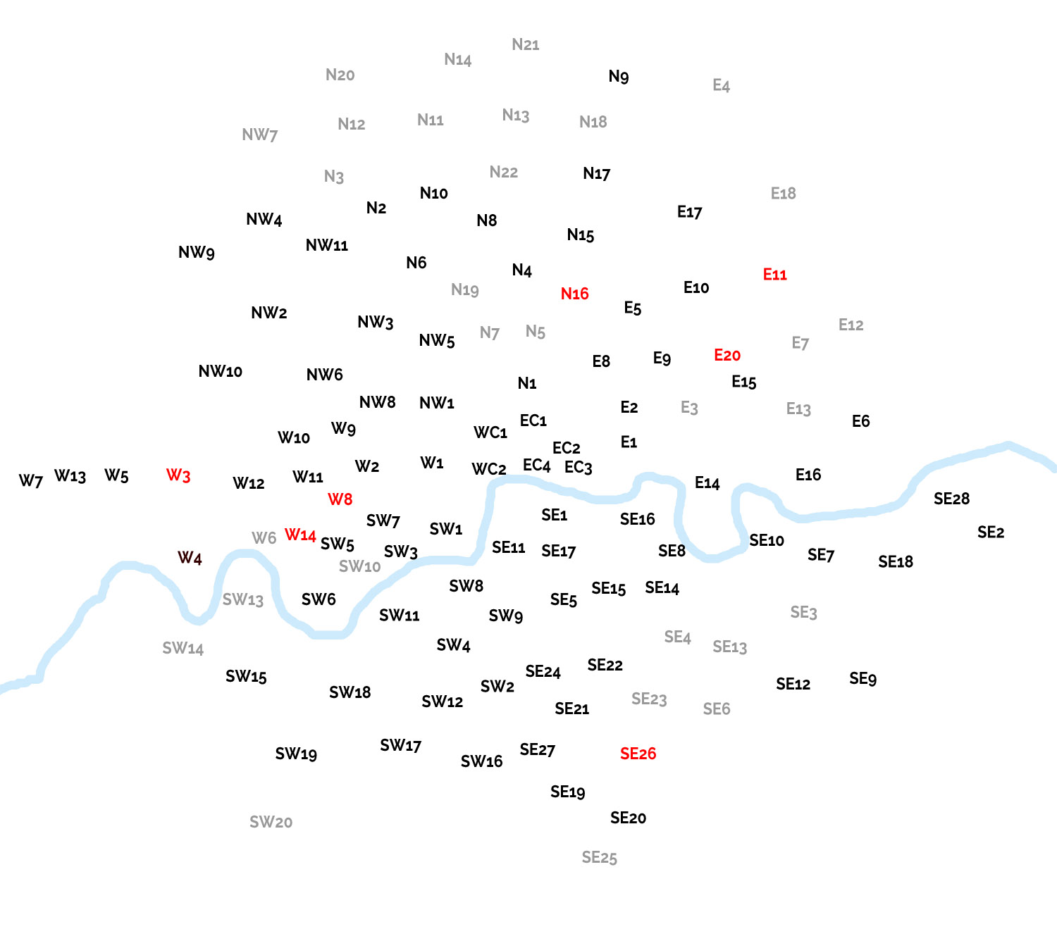
The 'Capital' project is here
Click here for the names of each postcode.
They extend out alphabetically from #1 hence the confusion of seemingly random numbers being adjacent to each other.
(x,y) co-ordinates expressed as % from top left hand corner
E1 - Eastern Head District (60,47)
E2 - Bethnal Green (60, 43)
E3 - Bow (65,43)
E4 - Chingford (68, 9)
E5 - Clapton (60, 32)
E6 - East Ham (81,44)
E7 - Forest Gate (76, 32)
E8 - Hackney (57, 38)
E9 - Homerton (62, 38)
E10 - Leyton (66, 30)
E11 - Leytonstone (81, 28)
E12 - Manor Park (81, 35)
E13 - Plaistow (75, 42)
E14 - Poplar (67, 50)
E15 - Stratford (70, 40)
E16 - Victoria Docks & North Woolwich (77, 50)
E17 - Walthamstow (65, 22)
E18 - Woodford & South Woodford (74, 20)
E20 - Olympic Park (69, 37)
EC1 - City of London (50, 44)
EC2 - City of London (53, 47)
EC3 - City of London (55, 50)
EC4
- City of London (51, 49)
N1 - Northern Head District(50, 40)
N2 - East Finchley(59, 49)
N3 - Finchley(59, 49)
N4 - Finsbury Park(59, 49)
N5 - Highbury (50, 35)
N6 - Highgate (39, 27)
N7 - Holloway (46, 35)
N8 - Hornsey (46, 23)
N9 - Lower Edmonton (59, 8)
N10 - Muswell Hill (41, 20)
N11 - New Southgate (41, 12)
N12 - North Finchley (32, 13)
N13 - Palmers Green (49, 12)
N14 - Southgate (43, 6)
N15 - South Tottemham (55, 25)
N16 - Stoke Newington (54, 30)
N17 - Tottenham (57, 18)
N18 - Upper Edmonton (56, 13)
N19 - Upper Holloway (44, 30)
N20 - Whetstone (32, 8)
N21 - Winchmore (50, 4)
N22 - Wood Green (48, 18)
NW1 - North West Head District
NW2 - Cricklewood
NW3 - Hampstead
NW4 - Hendon
NW5 - Kentish Town
NW6 - Kilburn
NW7 - Mill Hill
NW8 - St John's Wood
NW9 - The Hyde
NW10 - Willesden
NW11 - Golders Green
SE1 - South Eastern Head District
SE2 - Abbey Wood
SE3 - Blackheath
SE4 - Brockley
SE5 - Camberwell
SE6 - Catford
SE7 - Charlton
SE8 - Deptford
SE9 - Eltham
SE10 - Greenwich
SE11 - Kennington
SE12 - Lee
SE13 - Lewisham
SE14 - New Cross
SE15 -Peckham
SE16 - Rotherhithe
SE17 - Walworth
SE18 - Woolwich
SE19 - Norwood
SE20 - Anerley
SE21 - Dulwich
SE22 - East Dulwich
SE23 - Forest Hill
SE24 - Herne Hill
SE25 - South Norwood (57, 90)
SE26 - Sydenham
SE27 - West Norwood
SE28 - Thamesmead (90, 52)
SW1 - South West Head District
SW2 - Brixton
SW3 - Chelsea
SW4 -Clapham
SW5 - Earl's Court
SW6 - Fulham
SW7 - South Kensington
SW8 - South Lambeth
SW9 - Stockwell
SW10 - Brompton
SW11 - Battersea
SW12 - Balham
SW13 -Barnes
SW14 - Mortlake
SW15 - Putney
SW16 - Streatham
SW17 - Tooting
SW18 - Wandsworth
SW19 - Wimbledon
SW20 - West Wimbledon
W1 - Fitzrovia, Marylebone, Mayfair & Soho
W2 - Paddington
W3 - Acton
W4 - Chiswick
W5 - Ealing
W6 - Hammersmith
W7 - Hanwell (3, 51)
W8 - Kensington
W9 - Maida Hill
W10 - North Kensington
W11 - Notting Hill
W12 - Shepherds Bush
W13 - West Ealing
W14 - West Kensington
WC1 - Clerkenwell
WC2 - Covent Garden
Let's try some abstraction. Here's those postcodes as a 12x10 grid. I used an AI (Claude) to do the heavy lifting, below, with the following prompt:
'can you take a map of the 120 inner london post codes and arrange them in as close an order as possible, west to east, north to south, as a 12 by 10 grid allows'
| NW7 | N3 | N20 | N12 | N11 | N14 | N13 | N21 | N9 | N17 | N18 | E4 |
| NW9 | NW4 | NW11 | N2 | N6 | N10 | N8 | N22 | N15 | E17 | E11 | E18 |
| NW2 | NW3 | NW5 | N19 | N7 | N4 | N5 | N16 | E5 | E10 | E7 | E12 |
| NW10 | NW6 | NW8 | NW1 | N1 | E8 | E2 | E9 | E3 | E20 | E15 | E6 |
| W10 | W11 | W9 | W2 | W1 | WC2 | WC1 | EC1 | EC4 | EC2 | E1 | E13 |
| W7 | W13 | W5 | W3 | W12 | W8 | SW1 | EC3 | SE16 | E14 | E16 | SE28 |
| W4 | W6 | W14 | SW5 | SW7 | SW3 | SE1 | SE11 | SE17 | SE8 | SE7 | SE2 |
| SW13 | SW6 | SW10 | SW11 | SW8 | SW9 | SE5 | SE15 | SE14 | SE10 | SE3 | SE18 |
| SW14 | SW15 | SW18 | SW12 | SW4 | SW2 | SE24 | SE21 | SE22 | SE4 | SE13 | SE9 |
| SW20 | SW19 | SW17 | SW16 | SE27 | SE19 | SE25 | SE26 | SE20 | SE23 | SE6 | SE12 |
South London, south of the river and in blue, only constitues 42 of our 120 postcodes... hmm, 35%. We can work out the relative populations, lets do that later. For now our old London stats are returning an Inner London population of 4 845 786, kinda 5m. Remember that the postcodes and not the Inner London population which includes aread outside out postcode selection.
Afterword - the 42 South London districts comprise 1 670 761 people, 34.5%. Neat
That's fun. It gives us a different perspective.
Let's get an AI to dig into this, may be it'll keep it away from that pesky 'paperclip problem'.
make a grid with no limitation on cells and rows showing the postcodes but cells can be empty. its still a schematic but one more in keeping with Beck
Our cheeful energy chomping chum has knocked out a 23 x 19 grid:
Now being an AI it has plenty to say about it's work. We should remain sceptical of the middle-management blah AI is happy to trot out but, it does show method:
That's the Beck logic applied properly: same projection as before (equirectangular, scaled by latitude for longitude compression), but instead of forcing every point into a filled 12×10 rectangle, I snapped each postcode to its nearest grid intersection on a much finer lattice and let empty cells stand. Where two postcodes would've landed on the same intersection, I nudged one outward to the nearest free point rather than distorting the whole layout.
Net effect: relative position and topology survive (north stays north, the west/east and north/south gradients are legible), but you can now see London's actual shape — the dense core clustering tightly around Zone 1, the outer boroughs spreading out unevenly (further south and west than north or east), rather than that shape being crushed into a uniform box. It's an SVG, so every point is just a labeled dot at fixed coordinates — straightforward to open in Illustrator/Figma and hand-adjust positions once you're pinning actual photos to each one.
You wouldn't want to be in that meeting... still, it may be useful as a hanging guide, the (x,y) co-ordinate is expressed as a pixel position within the CSS! Now I'd like to associate population numbers with those postcodes but let's start with a simple adjustment to the CSS to give a weighted value to each dot specifying one of five district sizes. And of course, when I say we, I mean, AI...
Postcode Area
Now let's have some of that all important AI backchat:
Using Voronoi tessellation on the same centroids I built for the map — each postcode "claims" the territory closest to its centroid than to any neighbour's, which is a solid proxy for actual district footprint when centroids are reasonably evenly distributed.
Caveat up front: the outermost districts (W7, SW20, SE2, E4, SE25 — the top 5) are inflated by an edge artifact — Voronoi cells at the boundary of any point-set balloon outward because there's no neighbour beyond them to cap the cell. Treat their absolute values as unreliable; everything from roughly rank 6 downward is a fair comparative read.
Largest (genuinely reliable, ranks ~6–15)
NW7 Mill Hill · N20 Whetstone · SE9 Eltham · SW14 Mortlake · E12 Manor Park · NW9 Kingsbury/Colindale · E18 South Woodford · N21 Winchmore Hill · SE12 Lee · SE20 Penge
Mid-large
SE28 Thamesmead · SW16 Streatham · N14 Southgate · NW10 Willesden · E6 East Ham · SE18 Woolwich · W13 West Ealing · SW19 Wimbledon · W5 Ealing · SW17 Tooting
Solidly mid-pack (bulk of the set, ~4–8 km² proxy)
E17, SE6, W4, SW15, N9, E16, SE3/SE7, SW18, NW4, W3, NW2, N3, N18, NW11, N15, E14, SE16, E11, N12 …
Small — dense inner core
Most SW1–SW10, most SE1/SE5/SE11/SE14/SE15/SE17/SE24, N1/N5/N7/N19, NW1/NW5/NW6/NW8, E1/E2/E3/E8/E9, W9/W11/W14, W8, WC1/WC2
Smallest
EC1, EC2, EC4 (the historic City core — tiny, tightly packed districts) and SW5 (Earls Court), the single smallest in the set.
The overall shape confirms the obvious intuition and gives it numbers: outer-ring districts (Mill Hill, Eltham, Whetstone, Mortlake) run roughly 30–40× the footprint of the tightest City-core districts (EC1/EC2/EC4), even setting the inflated edge cases aside. That gradient — huge quiet outer wedges shrinking to a dense tangle of tiny historic parishes at the centre — might itself be worth encoding visually (dot size, or stroke weight) on the schematic if you want the map to carry that information rather than just position.
Want the schematic regenerated with dot size scaled to this ranking?
Had to look up Voronoi tessellation here: wiki.
We're closing in on our population stats... next let's assocate dot size with population size. This took a while to get the information we need. The AI was unable to extract all of the data so I had to mess about with the postcode districts spreadsheet for a bit to get the figures. Take that AI! Here's the prompt
so now we have a solid set of data for postcode population. using that data id like to create a map like our 'area of postocde map' but using the differing size of dots to show population size.
Population Size by Postcode
Here's our map showing comparative population figures... innarestin'!
So now we've got all the data we need to calculate comparative density using our five circle sizes. Time for a new prompt:
now can we take the data from the postcode area map and the postcode population map and create a map showing population density?
As an afterthought I had the AI add concentic circles at 5km intervals moving out from Charing Cross. I also added that code to the two other maps above. And whilst I was at it we added a north/south and east/west axis centred on Charing Cross - just about!
Population Density by Postcode
Fabulous...
Here's the AI blah...
Density = population ÷ area (using the same capped area proxy as before, so the same five edge-artifact districts don't distort things), same positions, same five-tier quintile sizing — but this map tells a genuinely different story from the previous two, which is the point of building it.
Densest districts (small footprint, lots of people): N1 (Islington), SE1 (Southwark/Bermondsey), E1 (Whitechapel), N16 (Stoke Newington), W14 (West Kensington), N7 (Holloway), SE5 (Camberwell), SW9 (Stockwell). Classic inner-city terraced/mansion-block territory — small parcels, high occupancy.
Sparsest: EC3, EC4, E18, SW14, N20, NW7, SE2, SW20, W7, SE25 — a mix of the almost-unpopulated financial-district core (EC3/EC4) sitting at one end of the same list as the large, leafy outer-suburb districts (Mill Hill, Raynes Park, Whetstone) at the other. That's the interesting bit: density collapses two very different kinds of "empty" — office London and suburban London — onto the same small-dot end of the scale, which the population map alone or the area map alone couldn't show you.
Now let's take these density figures and rework our postcode 'periodic table'. We can include the names and take the quintiles and express them as shades of blue providing a heat map of density. Darker/denser, simps!
| NW7 Mill HIll |
N3 Finchley |
N20 Whetstone |
N12 New Southgate |
N11 North Finchley |
N14 Southgate |
N13 Palmers Green |
N21 Winchmore |
N9 Lower Edmonton |
N17 Tottenham |
N18 Upper Edmonton |
E4 Chingford |
| NW9 The Hyde |
NW4 Hendon |
NW11 Golders Green |
N2 East Finchley |
N6 Highgate |
N10 Hornsey |
N8 Muswell Hill |
N22 Wood Green |
N15 South Tottemham |
E17 Tottemham |
E11 Leytonstone |
E18 Woodford & South Woodford |
| NW2 Cricklewood |
NW3 Hampstead |
NW5 Kentish Town |
N19 Upper Holloway |
N7 Holloway |
N4 Finsbury Park |
N5 Highbury |
N16 Stoke Newington |
E5 Clapton |
E10 Leyton |
E7 Forest Gate |
E12 Manor Park |
| NW10 Willesden |
NW6 Kilburn |
NW8 ST John's Wood |
NW1 NW Head District |
N1 Northern Head District |
E8 Hackney |
E2 Bethnal Green |
E9 Homerton |
E3 Bow |
E20 Olympic Park |
E15 Stratford |
E6 East Ham |
| W10 North Kensington |
W11 Notting Hill |
W9 Maida Vale |
W2 Paddington |
W1 West Head District |
WC2 Covent Garden |
WC1 Bloomsbury |
EC1 Clerkenwell |
EC4 The City of London |
EC2 The City of London |
E1 Eastern Head District |
E13 Plaistow |
| W7 Hanwell |
W13 West Ealing |
W5 Ealing |
W3 Acton |
W12 Shepherds Bush |
W8 Kensington |
SW1 Knightsbridge |
EC3 The City of London |
SE16 Rotherhithe |
E14 Popllar |
E16 Victoria Docks & South Woodford |
SE28 Thamesmead |
| W4 Chiswick |
W6 Hammersmith |
W14 West Kensington |
SW5 Earl's Court |
SW7 South Kensington |
SW3 Chelsea |
SE1 SE Head District |
SE11 Kennington |
SE17 Walworth |
SE8 Eltham |
SE7 Charlton |
SE2 Abbey Wood |
| SW13 Barnes |
SW6 Fulham |
SW10 Brompton |
SW11 Battersea |
SW8 South Lambeth |
SW9 Stockwell |
SE5 Camberwell |
SE15 Peckham |
SE14 New Cross |
SE10 Greenwich |
SE3 Blackheath |
SE18 Woolwich |
| SW14 Mortlake |
SW15 Putney |
SW18 Wandsworth |
SW12 Balham |
SW4 Clapham |
SW2 Brixton |
SE24 Herne Hill |
SE21 Dulwich |
SE22 East Dulwich |
SE4 Brockley |
SE13 Lewisham |
SE9 Eltham |
| SW20 West Wimbledon |
SW19 Wimbledon |
SW17 Tooting |
SW16 Streatham |
SE27 West Norwood |
SE19 Norwood |
SE25 South Norwood |
SE26 Sydenham |
SE20 Anerley |
SE23 Forest Hill |
SE6 Catford |
SE12 Lee |
E20 - no data available
I ran this problem past another AI (chat GPT) and it made an interesting observation:
That is actually a fascinating optimisation problem: rather than asking "what does the postcode map look like?", we're asking:
What permutation of London's 120 postcode districts makes a regular rectangular graph behave as much as possible like London's actual spatial graph?
The grid above is therefore best thought of as a cartographic projection of London onto a rectangular graph, rather than a conventional map.
One particularly nice consequence is that the postcode prefixes cease to be meaningful categories. The grid discovers the geography underneath the postal bureaucracy.
Ok Computer, let's try:
can you merge the the three quintile circle diagrams to give us a readable population/area/density diagram for the entire map? maybe we need to use a different statistical device? perhaps we can show all three circles?
Well that's a little complicated. Let's have the AI tell us about it:
Here's the logic: each district gets two circles and a colour rather than three competing sizes:
- Grey ring (stroke only) = relative area — bigger ring, bigger district
- Filled dot inside it = population — bigger dot, more people
- Colour of that dot = density (your existing blue palette, light→dark, sparsest→densest)
This makes the interesting cases genuinely legible at a glance, in a way three separate maps couldn't show together: look for a big ring with a small, dark dot — that's a large area with relatively few people but packed tight where they are (patchy density within a big footprint), versus a small ring with a big, dark dot — tiny area, lots of people, obviously dense (your N1/SE1/E1 cluster). A big ring with a big, light dot is the opposite story — large and sparse throughout, no crowding anywhere (your outer-suburb Mill Hill/Raynes Park territory).
It's worth being honest that this is denser to read than any one of the three originals on its own — it rewards someone who spends a few seconds per dot rather than scanning the whole map at once. If that trade-off doesn't suit the piece, the alternative is a 2×2 or 1×3 small-multiples layout (three maps side by side, same positions, same size), which sacrifices the "everything in one glance" ambition but is much faster to read cell-by-cell. Happy to build that version instead if this one feels too busy once you're looking at all 120 together.
I wanted to check the LLMs working, so I ran the problem of where to put the 120 postcodes in our 12 x 10 grid against ChatGPT. At first it came up with the same solution as Claude. Tick, gold star. BUT... I mentioned the 'Seven Bridges of Königsberg' in my prompt and that sent our AI chum off in a completely different direction.
Something of the thought behind this project is rooted in my days working as a bicycle messenger. The ability to envisage a series of addresses and their connections in the most efficeint way to get between then lay at the heart of the job. The postcodes became a key to comprehending how one can move through the city as quickly and profitably as possible. Our AI pal thought about what we're trying to do and decided that what I would call 'nearness' is important. So:
the right optimisation target is not "make the grid look like a map" but "minimise the geographic cost of every horizontal and vertical edge in the 12×10 lattice."
Then it did this:
π min (i,j)∈E ∑ d(p π(i) , p π(j) )
where:
- pkp_k = geographic centre of postcode district kk
- π\pi = permutation of the 120 districts into the 120 cells
- EE = the 218 horizontal/vertical adjacencies of a 12×10 grid
- dd = London-adjusted geographic distance.
Let's lay out the new grid and see what the AI has to say:
| N14 | N21 | N13 | N9 | E4 | E18 | E20 | E14 | SE10 | E13 | E15 | E11 |
| N20 | N12 | N11 | N22 | N18 | E17 | E3 | SE16 | SE8 | E16 | E7 | E12 |
| NW7 | N3 | N10 | N8 | N17 | E10 | E9 | E1 | SE14 | SE7 | E6 | SE28 |
| NW9 | NW11 | N2 | N15 | N16 | E5 | E2 | EC3 | SE15 | SE3 | SE18 | SE2 |
| NW4 | NW3 | N6 | N4 | N5 | E8 | EC2 | SE1 | SE17 | SE13 | SE12 | SE9 |
| NW2 | NW6 | NW5 | N19 | N7 | N1 | EC1 | SE11 | SE5 | SE4 | SE6 | SE20 |
| W5 | NW10 | W9 | NW8 | NW1 | WC1 | EC4 | SW1 | SW9 | SE22 | SE23 | SE25 |
| W13 | W3 | W10 | W11 | W2 | W1 | WC2 | SW3 | SW8 | SE24 | SE26 | SE19 |
| W7 | W4 | W12 | W8 | SW7 | SW10 | SW15 | SW18 | SW11 | SW4 | SE21 | SE27 |
| SW14 | SW13 | W6 | W14 | SW5 | SW6 | SW20 | SW19 | SW17 | SW12 | SW2 | SW16 |
We'll come back to that...
We need a river line to give our map a grounding in the familiar. Claude took twelve goes at getting the Thames onto our map. It's not perfect but it'll pass and it adds a sense of place.
And above the all important T-shirt design